Layout and title lettering adaptation: Dinotrux and A Vingança dos Dinotrux
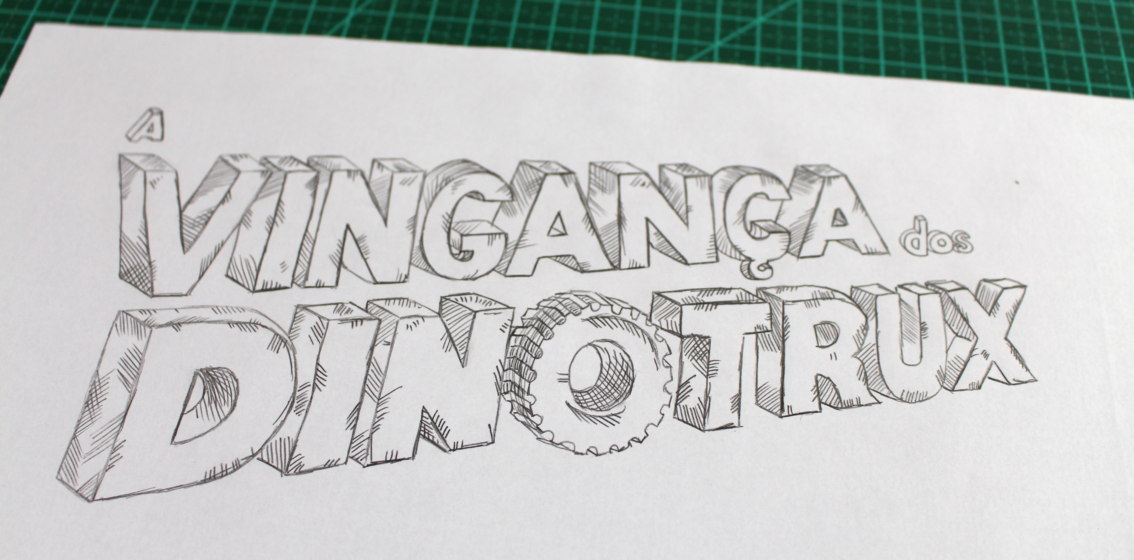
This project first steps were the studies of the characteristics of the letter in relation to the material and support. With that, I could also identify the shape for the digital finish.
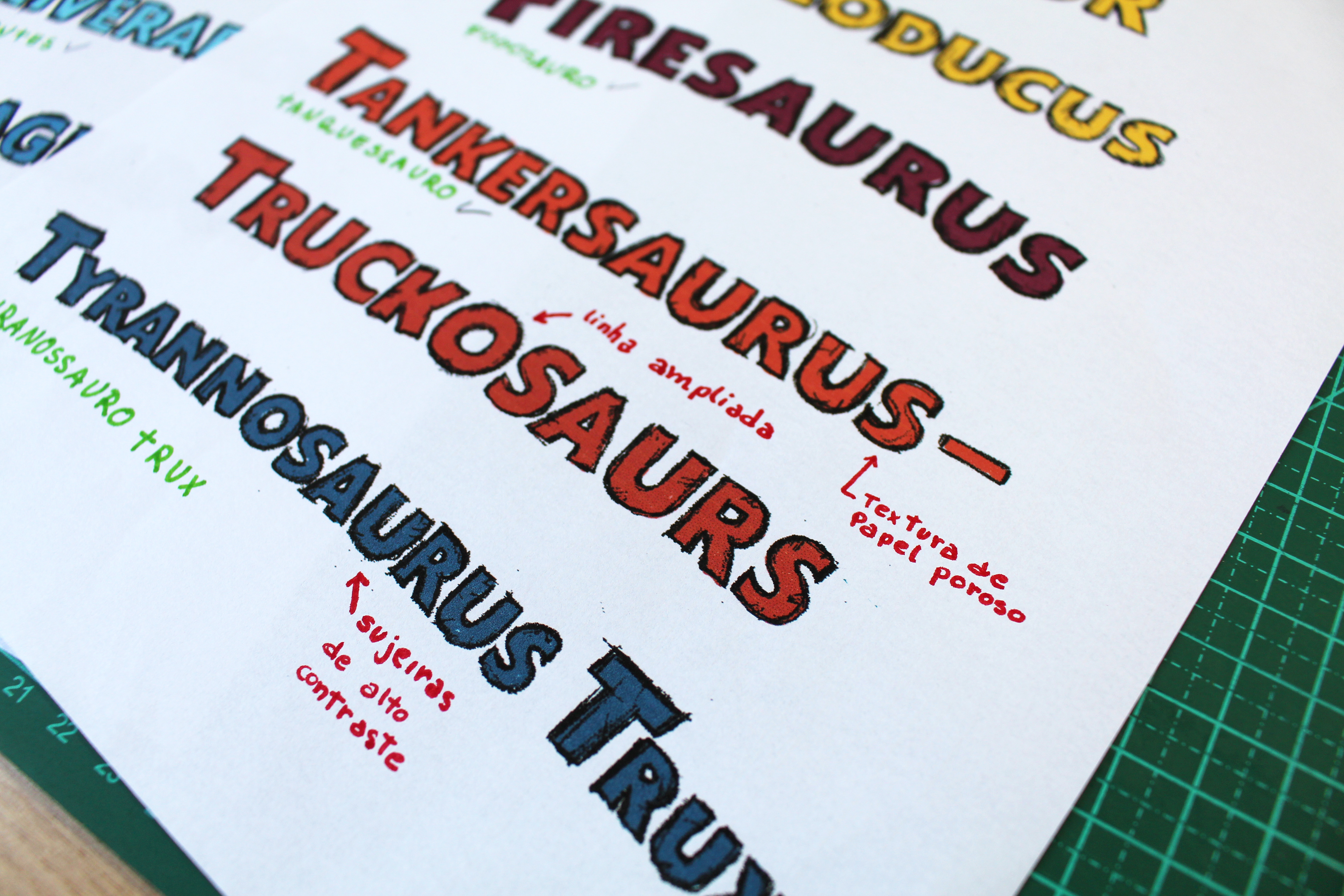
With the initial analysis, I found that the ideal for this would be a heavy graphite (6B) and a porous white sheet, and to scan and finalize it on high contrast.
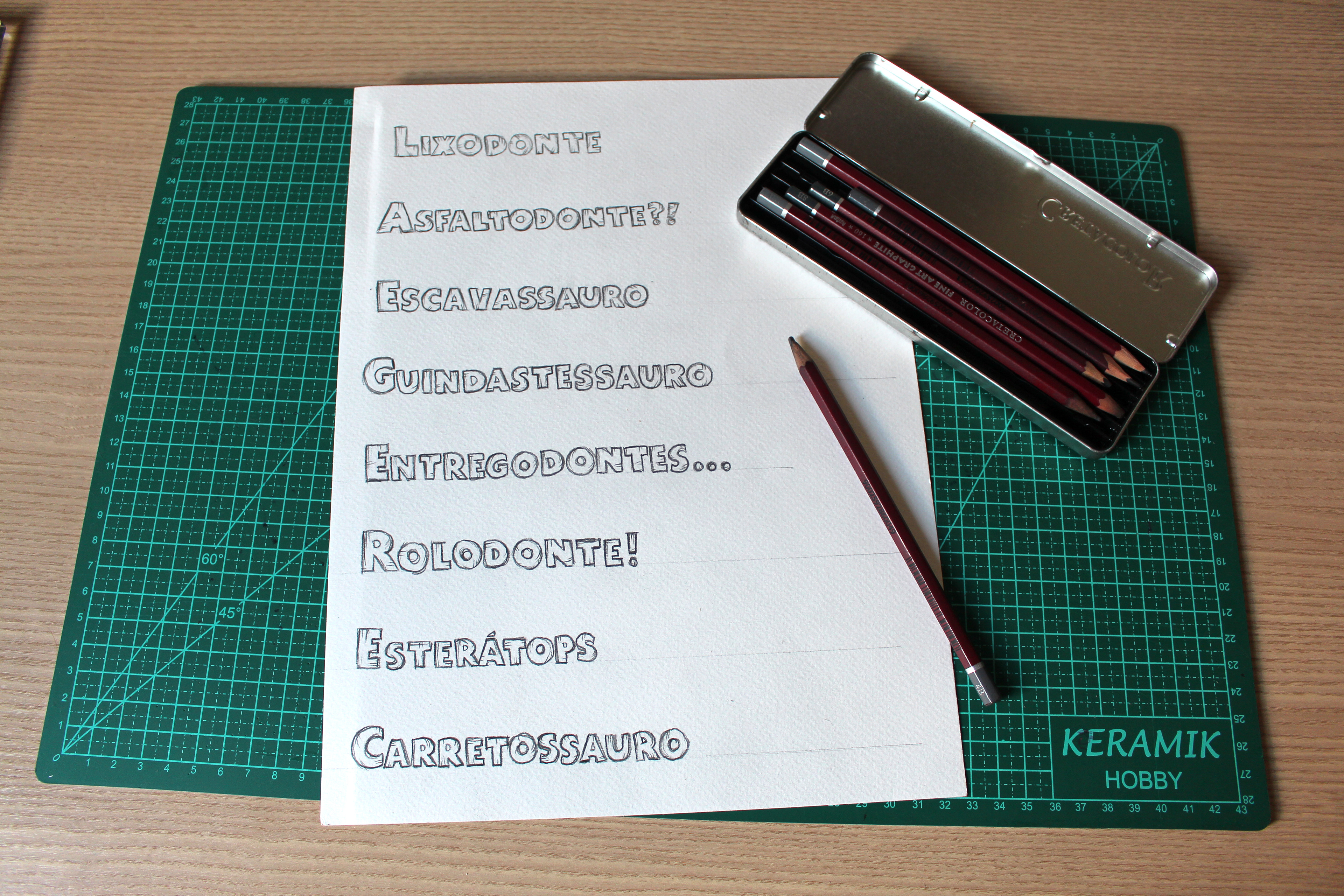
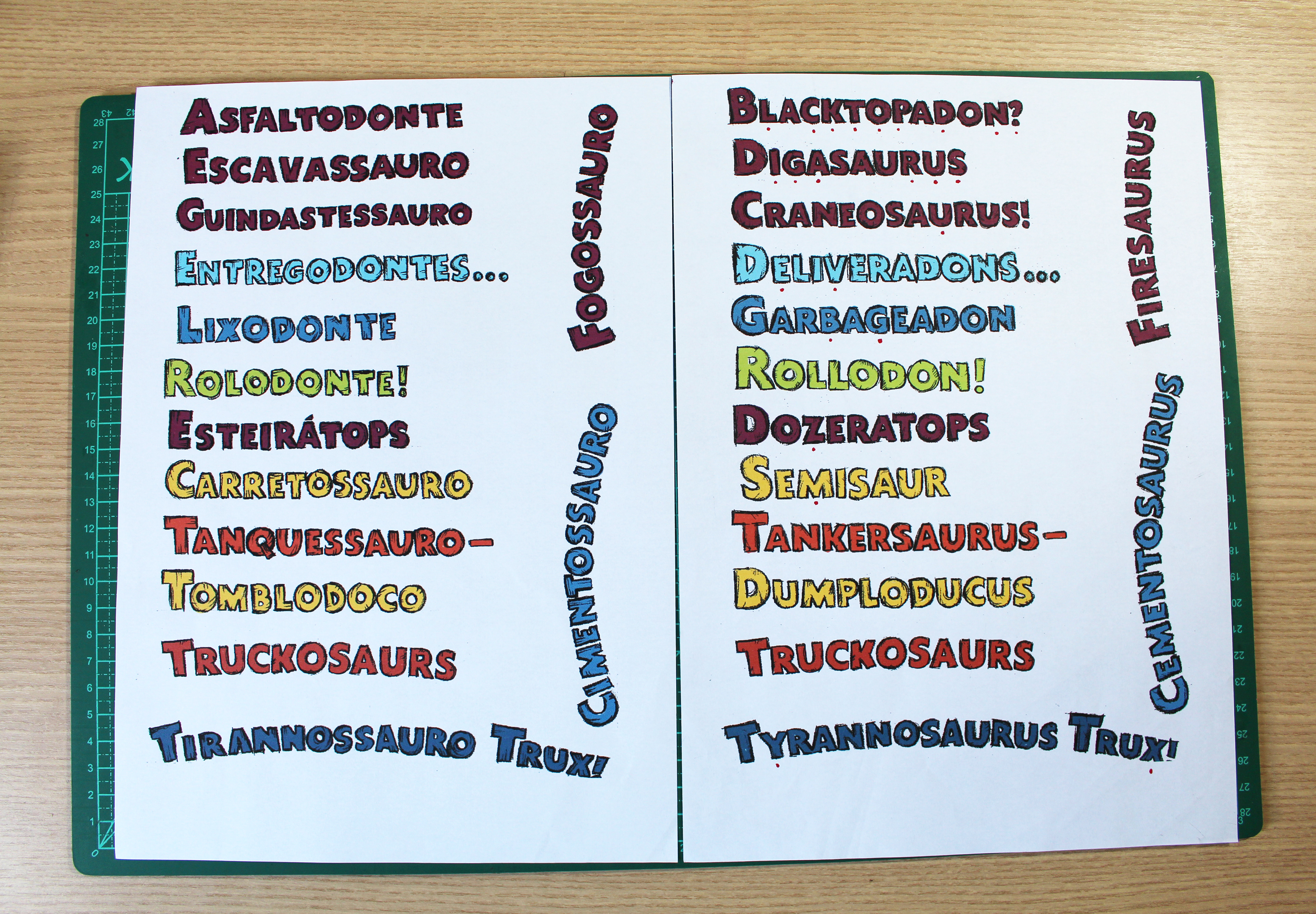
Portuguese version early drafts
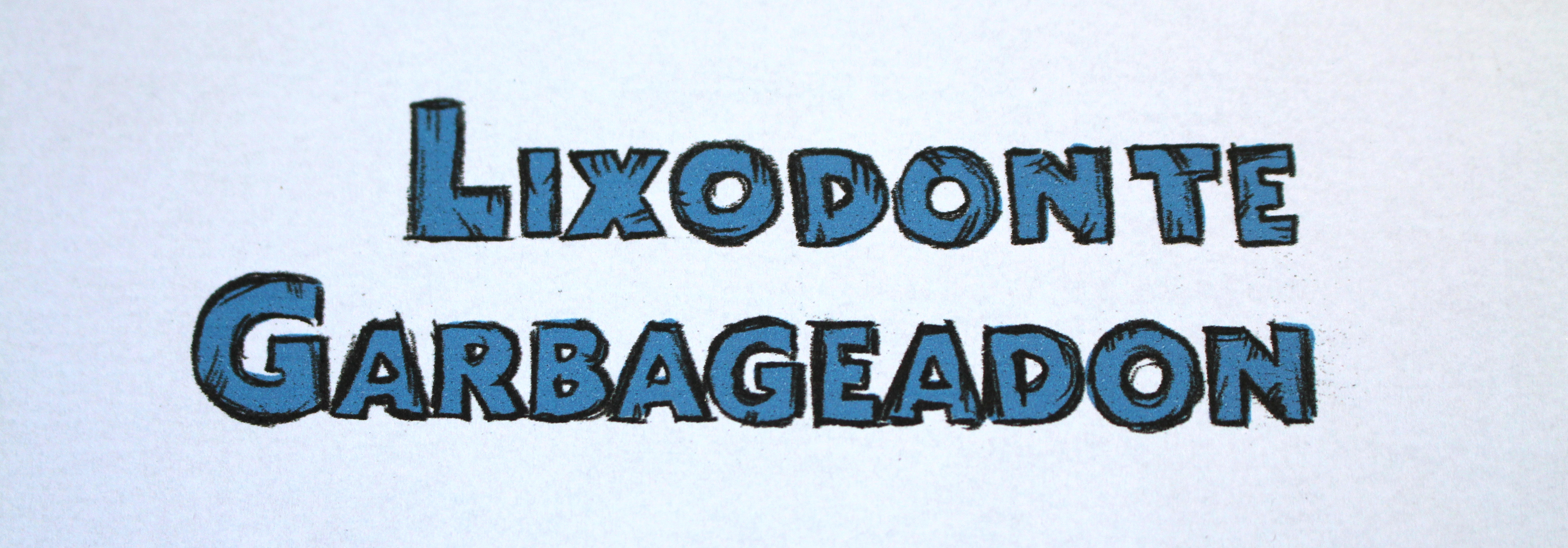
Title redesign
Comparing Portuguese and English letterings.
Here you can really see that, with the right material, you can get a similar effect to the original lettering.
Letters’ finishing details, identical to the original.
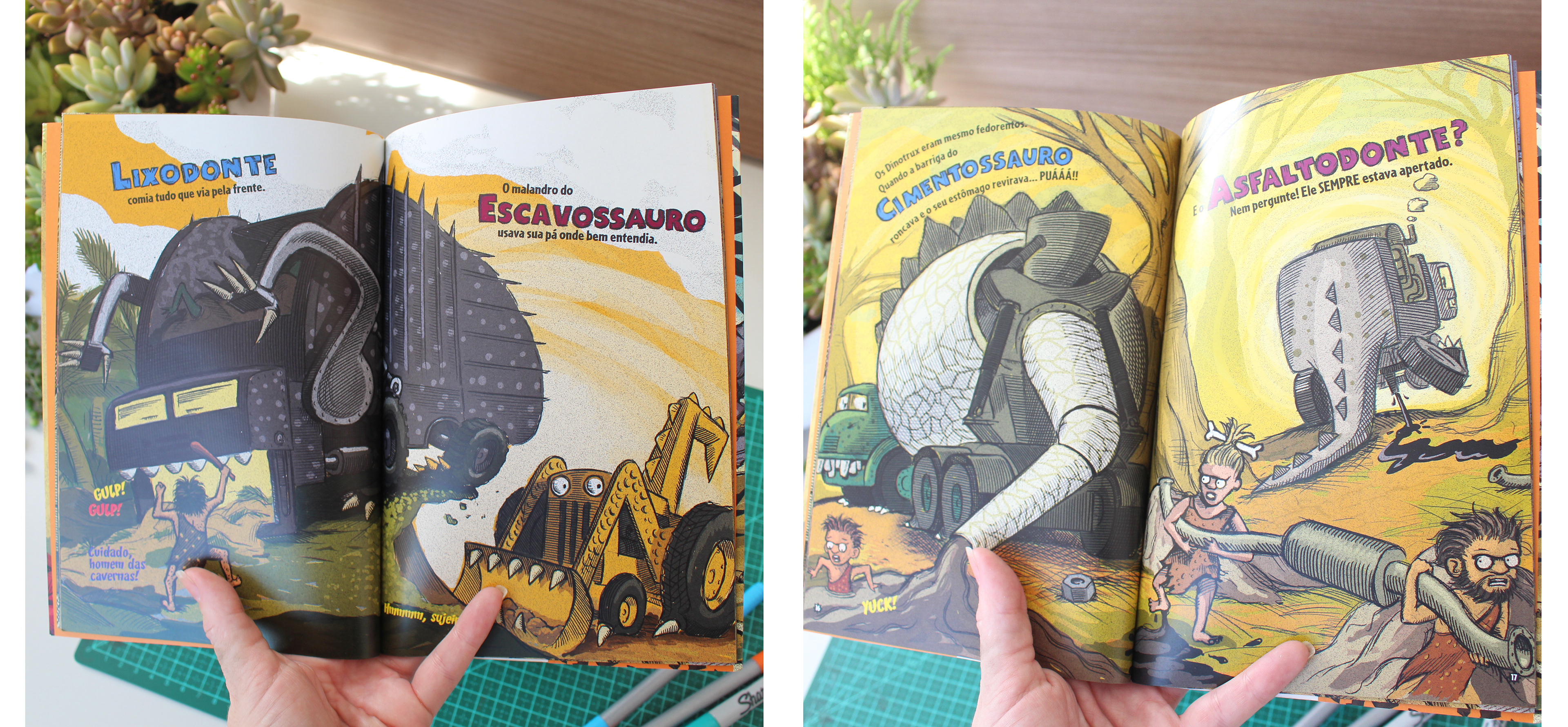
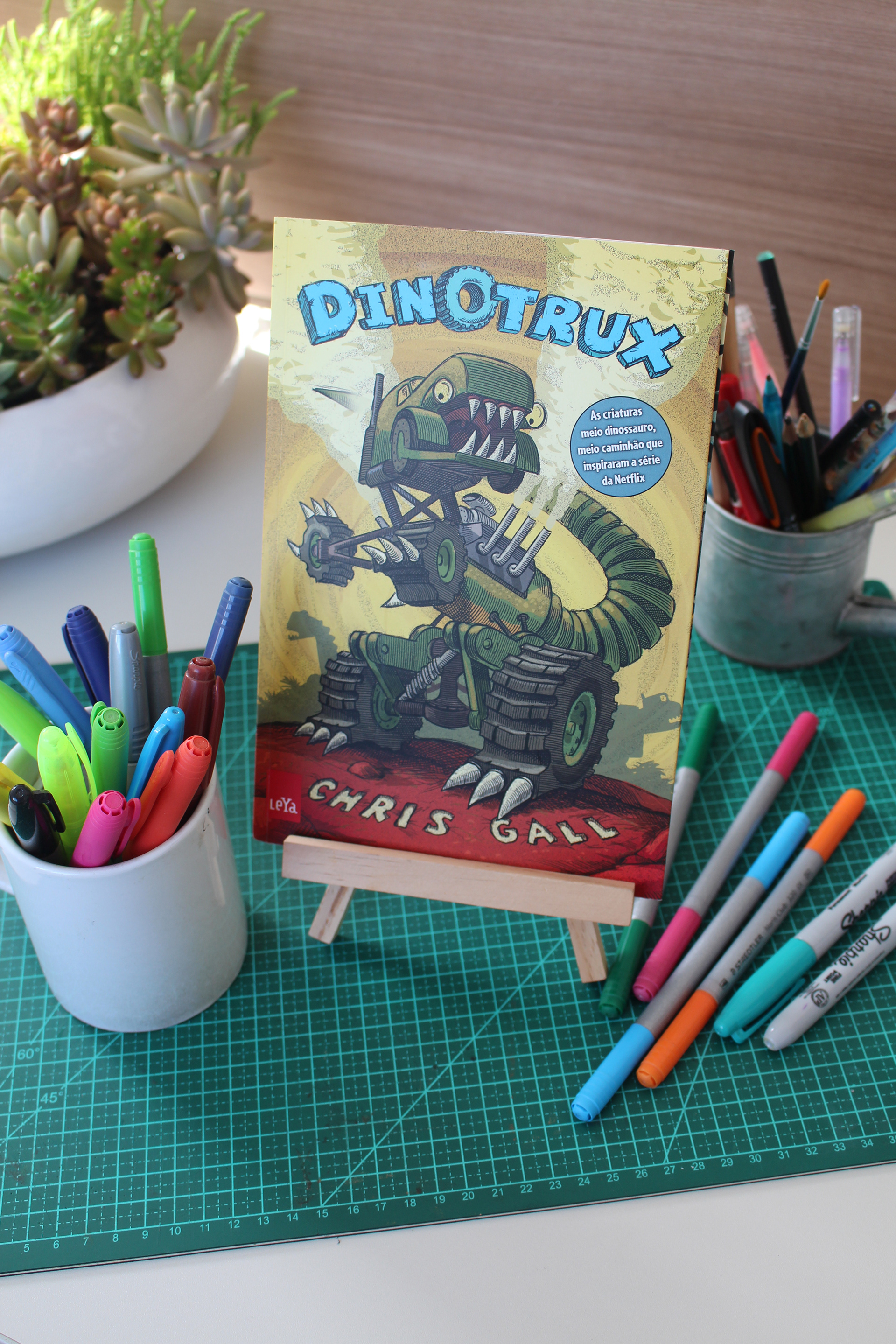
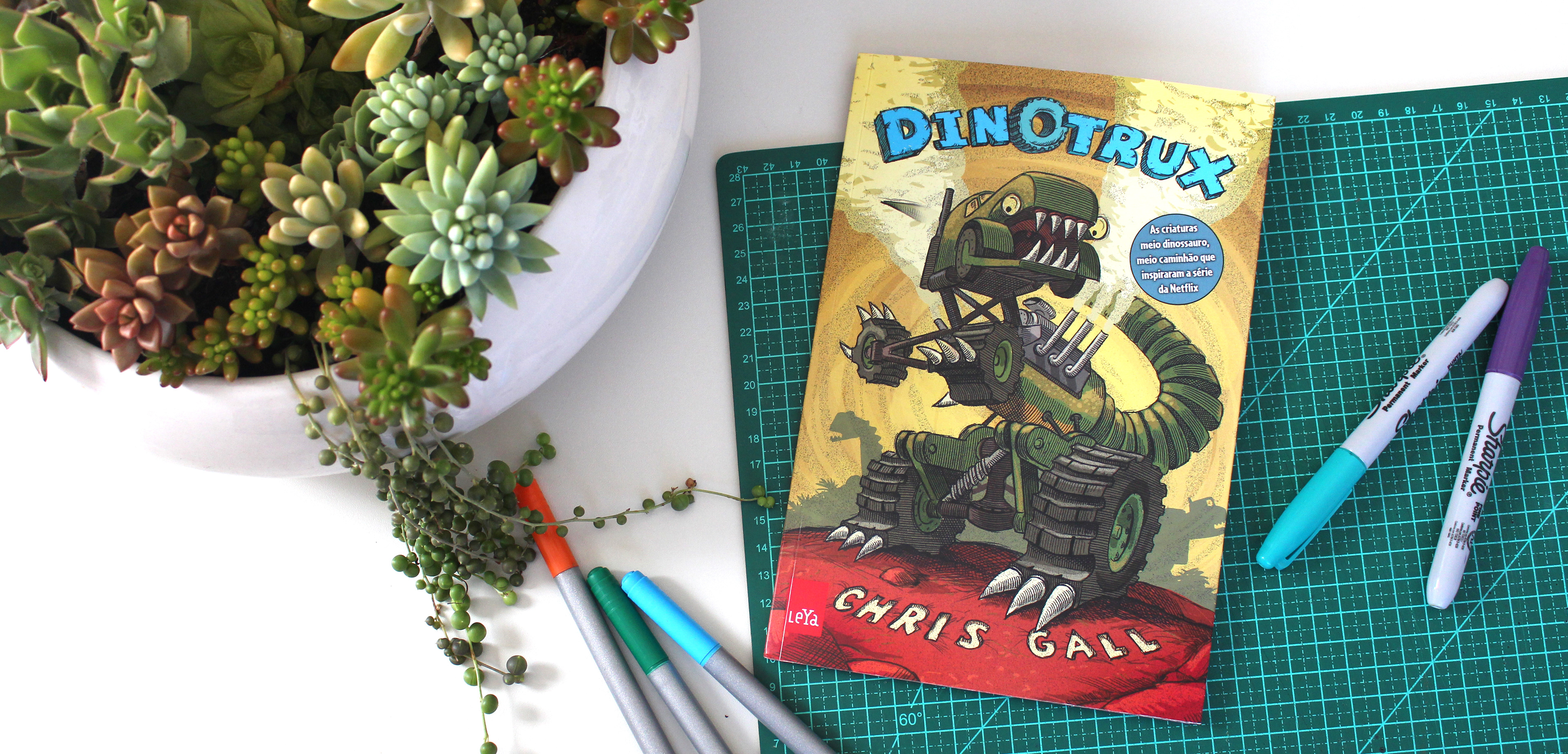
Resultado final aplicado ao livro.